
Monday, August 30, 2010
Most Sunday evenings, you will find Sweet Mr. and me enjoying 'Breakfast for Dinner. It's one of my favorite meal choices. We tend to like the traditional fare...fried eggs, crisp bacon, toast or English muffins, juice, and a large glass of cold milk. Yesterday, we added scrambled eggs to the mix (pun intended) for our precious daughter and son-in-love, who were joining us for supper. Late summer sun was still filtering through the Western exposure of the breakfast room as I finished setting the table.

I have always appreciated the design value of English Transferware, but there are several other significant reasons that I chose to collect and use it. Entertaining Tip: Like so many young brides, I went through a season of being enamored with Italian pottery. It was gorgeous; it was heavy; and it chipped every time that I looked sideways at it. Furthermore, many Italian pottery designs are manufactured for a short time and then discontinued. It became a burden to try to replace broken and chipped pieces, and I was not a happy camper. Next, I spent a number of years using Dansk Pottery, "Bistro," as my every day pattern. It was gorgeous, it rarely chipped or broke; but oh my, pulling it out of the cabinet and putting it away was like a full upper body workout! Heavy just doesn't adequately describe the weight of this dinnerware....Enter...my mother-in-love. She loved English Transferware, and one year for my birthday, she started my collection of Spode Tower Pink. We are blessed that we now also are the caretakers for her Copeland Spode Tower Pink. You can spot a portion of it in the Welsh Dresser in the background. English Transferware...it was a wonderful new world of dinnerware. It's gorgeous, it rarely chips, or breaks, I can find replacements on the secondary market if needed, and it is relatively light weight. And so it began...

After the service of Spode Tower Pink was completed, my generous Mother-in-Love asked me what I next would like for my birthday, Christmas, etc. I had seen and fallen in love with Furnivals 'Blue Quail.' Between my MIL and the rest of my family, it didn't take too many holidays to complete a
service of this wonderful blue and white transferware pattern. Furnivals eventually went out of business, but their designs were bought by Mason's, who continued to produce this pattern in the blue and in a wonderful brown. The blue/yellow laminated fabric placemat is by Patricia Spratt for the Home, www.patriciasprattforthehome.com.
The blue quilted tumblers have been in use for years. A number of manufacturers make this design, including Fostoria. I think that these were made by Colony. The cut crystal juice glass belonged to Nana, and I don't know who made them. The stainless is Towle, 'Antique Bead.'

I didn't spend a great deal of time planning this tablescape, maybe ten minutes before the kids arrived. There were no plans for a floral centerpiece; I grabbed the Blue Quail tureen and a pair of blue and white candlesticks from Portugal. A cobalt butter dish by Mosser Glass and a blue glass pitcher from a local thrift shop completed my design for a simple family meal.

The last of the day's sunshine is gently dancing across our table. The bacon smells so good, and my Sweet Mister is preparing to fry and scramble the eggs. My precious daughter and SIL are fixing the toast and English muffins, and I'm ready to pour the juice and ice cold glasses of milk. We're right here most Sunday evenings; I hope that you'll join us some time for a simple meal and fellowship. You would be welcome at our table.
I'm linking for the first time to "Blue Monday" sponsored by http://smilingsally.blogspot.com
Thank you Sally for the opportunity to immerse myself in my favorite color, blue! Click here to hop on over and join other bloggers who are participating in this wonderful meme.
I'm linking for the first time to "Blue Monday" sponsored by http://smilingsally.blogspot.com
Thank you Sally for the opportunity to immerse myself in my favorite color, blue! Click here to hop on over and join other bloggers who are participating in this wonderful meme.
Wednesday, August 25, 2010
I shall always come back to blue. I love so many different hues and shades of color, and I mix and match them with abandon. Yet, time and again, I find myself returning to tones of blue, for dressing, for special touches in my home, and for my tablescapes. For me, 'having the blues' is not always a negative thing...certainly not when I'm designing a table. This day, I set a feminine table for a birthday luncheon for my dear friend Debbi. Life had been hectic recently for the five of us, and I wanted to create a soft and gentle vignette...a spot to stop for a while...and dine and share fellowship with precious friends.

For groups of five to eight, I often host my guests at the game table in the living room. The table itself is 42" in diameter, which becomes pretty congested for anything more than four place settings. Tip: I frequently use my Flip-top Table Top to turn my 42" table into about a 60" round table. I ordered two of them, and I have several friends who also have a couple of them. We share them with each other when needed for entertaining large groups. Think Co-op with your friends! I also ordered the zippered covers for them, and they story easily in the garage. I ordered the flip-tops from By Invitation Only. Should you wish to inquire about the flip-top table tops, you can e-mail Sandy, the owner, at byinvitationonly@cox.net.

My first step in creating my table was to choose some soft, feminine linens. I selected a handkerchief weight white linen undercloth with white embroidered furls and DOTS...I adore polka dots! My primary topper is a 70" light blue matelasse cloth. For a final special touch...

I layered the center of the table with a wonderful small 36"lace table square that came from, you guessed it, our precious Nana. Nana's white linen cutwork lace napkins added some refined texture. I tied them with a length of blue and white checked silk ribbon. For a touch of bling, I attached a variety of sparkling earrings and shoe clips to each napkin. That choice earned rave reviews from my guests! A simple place card, made with my Cricut Expression, was tucked into each napkin.

Accompanying the cutwork napkins to the party was the Reed & Barton "Francis I" flatware that once belonged to my mother-in-love. For my centerpiece, I placed an old-fashioned 'frog' in the base of one of Nana's crystal bowls with an applied sterling silver overlay design. I continued the soft color palate with pink roses, Dutch Iris, and white lilies. Around the base of the arrangement, I inserted white w/ pink Alstroemeria, or Peruvian Lily. The flowers were all from Sam's, my go to flower market whenever possible. If I do this arrangement again, I'll delete the Alstroemeria. It was one extra flower that I really didn't need. The 'stand' beneath the crystal bowl is actually the base to an antique porcelain double ink well...an example of 'look around and use what you have.' The pair of reticulated Italian creamware urns flanking the centerpiece are an eBay find, and they have a neat provenance. I bought them from a woman in Australia. She said that they had belonged to her great aunt. She worked for a 'mail' company, and she promised that they would arrived safely. I like them so much, and they make me smile...if you look at them closely, you'll realize that the little lady must have decided that she wanted the roses to be a darker pink...so she painted them! But she must have become tired because she didn't paint all of them.

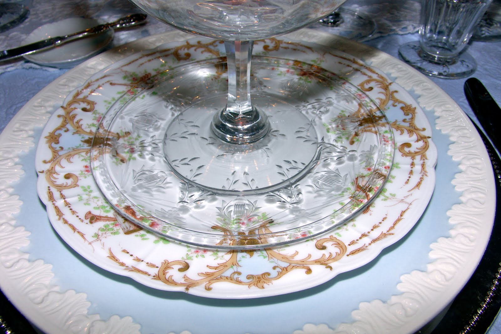
A silver charger plate with a beaded rim was used as the first layer of my place setting. Next comes a Wedgwood, 'Albion' dinnerplate. I topped it with a Haviland, "Instruments" on a Diana blank luncheon plate. I can never pick just one design when I'm asked to name my favorite pattern, but this luncheon plate ranks right at the top of my list every time. The workmanship in this plate is true artistry in my eyes. Our first course soup was served in Nana's crystal chiller with its matching under plate. I don't know who manufactured this crystal. I have been told by numerous antiques dealers that it is French, and it is hand blown and hand cut. I love to use it; it is one of my favorite things.

I am always captured by the reflective value of crystal in a tablescape. Add a little candlelight, and the crystal pieces appear to 'dance' before your eyes. The wine and the water tumbler are also part of Nana's French crystal. For this tablescape, I mixed them with Waterford Simply Blue, an eBay find that I collected in three colors. It is an interesting blue, and it almost seems to change color, depending on the shade or hue of blue with which I mix it. Did I tell you that I love blue?...I thought so. I bought them reasonably at the right time. They have drastically increased in price in the last year. The butter pat that you see tucked in next to the plate is Haviland "Ranson."

Everything is ready, and I hear the door bell's chime....

I'm ready to "Stop the World, I Want to Get Off." Let's enjoy some wonderful food together and while away the afternoon with treasured fellowship and conversation. I'm so glad that you are able to join me!
Thank you, yet again, to Susan at Between Naps on the Porch for hosting her magical meme, "Tablescape Thursday. I'll be linking my post to "Tablescape Thursday. Click on the button below to hop on over and check out the myriad of marvelous tablescape designs, after 9:00 pm on Wednesdays. You'll be glad that you made the trip...it's a wonderful adventure.

Wednesday, August 18, 2010
Whether a party is for four or twenty-four, I think that it's worth the time and effort that it takes to let my guests know that they are more valuable to me than the finest jewels. Today, the party was to celebrate my dear friend Janet's birthday, and there were four of us who gathered around the table for lunch.

Janet is an accomplished hostess in her own right, and I wanted to do something fun...something with punch and a tad on the contemporary side...lots of color and texture.

One of my fuschia matelasse tablecloths set the tone for the party. I found them at Horchow Finale in Dallas. They were $19.00 each, and I bought multiples, including one for my daughter-in-love. A visit to Horchow Finale is always like participating in a marvelous treasure hunt. I highly recommend the adventure!

I found these whimsical metal party hats and the delightful 'Happy Birthday' cake pedestal in the gift shop at my hair salon, for Pete's sake! (I go once a month to "get back to my natural blonde.") They were marked for deep discount...yippeeeeee!! Keep your eyes open; you never know where you'll find the next perfect accessory for your tablescapes! For place cards, I made the scalloped discs on my Cricut Expression using a double-sided card stock. The black and white metal flower pots and charger plates are Mackenzie-Childs "Courtly Check." It is such an amazingly versatile pattern, and I enjoy the graphic punch that they add to a design. The frosted chillers belong to my precious friend, Cindy. She contributed a delicious chilled avocado - cucumber soup for our feast. It was so delicious! You can check out Cindy's creative genius at http://www.moreentertainingwomen.blogspot.com
The assorted colors of the party hats were the guiding factor when I selected the sunflowers, Dutch iris, and pink roses for our centerpiece.
 The bamboo handled flatware was a great find at Big Lots. Janet, the birthday girl, and I each bought 24 placesettings. We thought that they would be fun for large gatherings, and we agreed to 'co-op' them. They were less than $1.00 per piece...great 'get.' The tiny individual salt and peppers are Mackenzie-Childs. I collect them one pair at a time; they're a bit expensive. The conical blue wine goblet is by Dorothy Thorpe. She was a California artist, and she was popular beginning in the 1930's and on into the 1950's. If you are fan of the television series, "Mad Men," you might see her products used in episodes involving cocktails and entertaining. These goblets belonged to our Nana. The Lalique Crystal tumblers with the palm fronds, so very Art Deco, also came from Nana. Also from Nana's linen closet, so many years ago, the vintage monogrammed damask dinner napkins added a crisp, clean line to the design. I wrapped each napkin with a lacy green ribbon, simply adhered into a ring using double-sided tape on the under side. My birthday gift for Janet was also wrapped using the same ribbon.
 In addition to the Mackenzie-Childs, "Courtly Check," I sandwiched a Royal Doulton, "Harlow" dinner plate under a smaller 10" white dinner plate. Entertaining Tip: I pick up these 10" dinner plates with a simple gold rim from antique stores and estate sales. The ones that I have found thus far are made by "Johnson Brothers, Haviland (France), Limoges from Bassett, Austria, and RK - Austria. They are available very inexpensively, and any design or size differences are negligible. I usually find a stack of them, and I buy them all. They come in handy for large groups in a buffet situation and when I want a plate with minimal decoration. You'll notice that I started out my design with the Haviland "Ranson" cream soup and underplate. That's the matching bone dish, top left, that I used as a bread plate. When Cindy brought her lovely chillers, I switched out the soups. Flexibility is often the key to a successful tablescape design. You'll also notice that at this point, I was considering the matching Dorothy Thorpe tumblers to go with the conical wine goblet. They eventually stepped aside to make way for the clear and textured Lalique.
 My guests have arrived, and lunch is ready to put on the table. Some day, I'd love to have you at my table, too! Let's party!
Thank you, yet again, to Susan at Between Naps on the Porch for hosting her magical meme, "Tablescape Thursday. I'll be linking my post to "Tablescape Thursday. Click on the button below to hop on over and check out the myriad of marvelous tablescape designs, after 9:00 pm on Wednesdays. You'll be glad that you made the trip...it's a wonderful adventure.


Thank you, yet again, to Susan at Between Naps on the Porch for hosting her magical meme, "Tablescape Thursday. I'll be linking my post to "Tablescape Thursday. Click on the button below to hop on over and check out the myriad of marvelous tablescape designs, after 9:00 pm on Wednesdays. You'll be glad that you made the trip...it's a wonderful adventure.
Tuesday, August 17, 2010
A number of blog friends have commented that it would be nice to know more about the 'peg nappies' that I enjoy using in flower arrangements for some of my tablescapes. So here's a brief introduction to 'Peg'...

from top.....

to bottom.
"Nappy" is an old term for a small bowl. A berry bowl would be an example of a "nappy." Now imagine a peg attached to the bottom of a berry bowl that would allow it to fit in the opening of a candle holder. That is a "peg nappy."
Large candelabra often have a center candleholder that sits a touch higher than the surrounding candleholders on the piece. When you see a flower arrangement placed in that center position with candles surrounding it, that flower arrangement is commonly constructed in a peg nappy. The peg on the nappy resembles the bottom of a candle taper. I have found that I don't necessarily have to limit arrangements made in a peg nappy to candlesticks. They will rest nicely in just about anything that is the correct diameter. Peg nappies are usually clear glass, so they are practically invisible in the arrangement. I fill the nappy with soaked oasis and go for it. Because the nappies are quite shallow, I add water to the flowers just about daily.
Replacements usually will have a listing for 'peg nappy,' and I often find them on eBay, too. Check them out! Peg nappies are a wonderful tool. I keep about 8 of them to be able to make arrangements for multiple tables. I don't worry about whether or not they are all exactly alike because they really don't show in the arrangement. I often plop the nappy in a container for one event, and then I pick it up and plop it in another container for a totally different tablescape the next day or so. So versatile...makes it possible to get a lot of mileage out of one arrangement.
Here are some examples of peg nappy arrangements...

If you look closely, you can see the peg nappy, and you can also spy the 'peg' resting inside the throat of the candlestick.

Can you tell...

That I get a lot of mileage out of these particular candlesticks? They are so versatile!
On the other hand...

the peg nappies also worked well in these reticulated hurricanes...

as well as in this simple blue & white import vase....

and a few days later, the same flowers were transferred to these Lenox urns for a teaparty at my precious daughter's house. Plop, plop, plop...instant centerpiece!
Hope this helps. Let me know if you have other questions, and I want to know if you decide to give them a try.
I am linking this post to "Centerpiece Wednesdays" at http://www.thestylesisters.blogspot.com
Thanks to The Style Sisters for hosting the party. Hop on over and see all the great ideas!

I am linking this post to "Centerpiece Wednesdays" at http://www.thestylesisters.blogspot.com
Thanks to The Style Sisters for hosting the party. Hop on over and see all the great ideas!
Thursday, August 12, 2010
I am always elated when my girls, my precious daughter and my dear daughter-in-love, use their many skills to entertain their friends and families. Recently, KC, my daughter, hosted a lovely tea party for some of her close friends. I was privileged to snap a few photos prior to the arrival of her guests.

It was a beautiful day, and the sun cast a lovely light on the small dining room in KC & David's second floor duplex.

The Copeland Spode Jewel hostess tray was filled with scrumptious cupcakes from Cuppies & Joe. www.cuppiesandjoe.com
The silver coffee pot that is visible in the far corner of the table was one of Sweet Mr.'s and my wedding gifts. I'm thrilled that she enjoys using it. Under the plates lie an assortment of vintage linens that once belonged to our Nana, KC's great-grandmother. KC is a family historian, and she cherishes the treasures that came from her great-grandmothers and grandmothers. Some day I'll post a tour of her home, filled with their wonderful things from the 20's and the 40's.

Sweetheart roses and Carnations were arranged in peg nappies and placed in a pair of Lenox urns, picked up at estate sales. The charming ramekins are Limoges and belonged to Nana. The underplates are Haviland Ranson, with a gold rim and a monogram. I bought them for KC on eBay.

Spode Tower Pink luncheon plates added a soft touch of color that enhanced the design of the table. The goblets are Vera Wang "Duchesse," and KC continued a family tradition by choosing her grandmother's silver pattern, Reed & Barton, Francis I. Did you notice the blue and white bowl in the corner cupboard? It is filled with sachets made from antique handkerchiefs. The hand painted china clock on the second shelf belonged to her maternal great-grandmother. She adores that old clock.

I painted the dining chairs for KC as well as the table and Welsh dresser. It made me happy that she wanted to feature my work.

When asked by some of her friends, "How do you even know how to do this?" KC sweetly replied, "This is how I grew up. I watched my Mom and my Grandmothers." And then they said, "We want to learn, too!"

So welcome to my soapbox...It is our generation that must pass on to the next generation, the delights that come with setting a beautiful table to welcome our friends and family. It broke my heart when I learned that magnificent companies like Wedgewood, Waterford, Spode, Royal Doulton, Royal Worcester, and Lenox had declared bankruptcy. Many young brides are no longer choosing fine china, crystal, and silver. Have we waited too long? Have we dropped the ball? I don't believe that it is too late, and it is one of the reasons that I continue to make the effort to plan lovely parties for Brides-to-be and Mothers-to-be. I am always thrilled with the interest that young women exhibit when they sit at one of my tablescapes. They want to learn, and they are excited about entertaining with beautiful things. They are willing to make the effort...are we willing to share our knowledge with them and set an example? From the many creative tablescapes that I see in our blog world, I think that the answer is a resounding 'Yes!'
I want to offer a sincere and enthusiastic "Thank you!" to Susan at Between Naps on the Porch for hosting "Tablescape Thursday." I am linking to TT, and I hope that you will check out all the contributions to this marvelous meme...so many great ideas!
I want to offer a sincere and enthusiastic "Thank you!" to Susan at Between Naps on the Porch for hosting "Tablescape Thursday." I am linking to TT, and I hope that you will check out all the contributions to this marvelous meme...so many great ideas!
Sunday, August 8, 2010
I am linking my post to Outdoor Wednesday...with a twist. The Bavinger House by Bruce Goff takes 'bringing the outside in' to a new level...and it was built in the 1950's. I hope that you enjoy it. Thank you to "A Southern Daydreamer" for hosting this delightful meme.
Daddy was a new member of the faculty in the Oklahoma University School of Architecture in 1950. The head of the architecture department was Bruce Goff, Frank Lloyd Wright's famous protege. Goff designed The Bavinger House, built outside of Norman, Oklahoma. The house was physically built, mostly on the weekends, by Goff, Bavinger, and a number of faculty and students from the university, including my daddy, from 1950, to 1955. I remember weekends spent driving out to the house to take lunch to daddy and to see the project in process. Gene and Nancy Bavinger were family friends. The Bavinger's older son, Bill, was a year younger than I. Bill was one of my sister's best friends, and we spent many great times at the Bavinger House as children and teenagers. The house is now recognized as one of the fifteen most important architectural designs in the United States. It has recently been opened to the public for visits by Bob Bavinger, Nancy and Gene's younger son. I stopped by to revisit some old memories, and I couldn't resist taking some photos. I only had my iPhone, so I hope that the images translate adequately. I thought that you might enjoy a short tour.

The view as one approaches the house is pretty amazing. The roof line starts at ground level and spirals to a peak. It always made me think of a stone tower surrounded by a sweeping sail. The main entrance is to the right of the lowest roof level and down some steps. The materials are mostly native stones and melted down 'junk glass.' It always reminded me of the green glass in old Coke bottles. I can still picture my daddy and others carrying those stones and glass pieces and placing them to create this incredible structure.

After descending the entry steps, the first thing one discovers is this stunningly beautiful patio area. Can you see the suspension bridge laid through the trees in the upper left of the picture?

The suspension bridge is accessed from within an upper level of the home. As children we used to scamper across the bridge, which hangs above a deep ravine, to visit the Wilson House, on the other side. The bridge is actually quite narrow, and I don't think that I would venture out on it now.

Can you see the top of the giant bronze pot just to the right of the patio trees? It's an outdoor fireplace, found on a lower level of the patio. The table and chairs are original to the home, as are the sculptures.

This view looks back toward the front door. This interior wall is built below ground. Remember the beginning of the roof, almost at ground level? That's the location of this area. The junk glass is beautiful as it reflects the sunlight. There used to be a profusion of gorgeous orchids growing out of the walls. Bob Bavinger hopes to replant them at some point. Pretty amazing, right?

The Bavinger House was heated with these stoves; remember that the house was built in the countryside, and there was a minimum of utility service available in 1950. Behind the stove, notice the recessed area beyond the rock. There used to be a 'creek' that ran through the house. It was dammed up at some point. The large suspended 'saucer' that you see is the living room. Above the living room, you can see a bit of another 'saucer' that was the Bavinger's master bedroom. The drapery panels that you can observe could be drawn for privacy. The large round tubular structure that you see is a closet for the master bedroom. It's an interesting concept. Inside the tube, the hanging apparatus is actually a 'lazy susan.' The closet rack rotates, and provides quite a bit of storage.

From the living room pod, one can see the Master Bedroom pod and above that Bill Bavinger's bedroom. Follow the stairs higher, and you would reach Gene Bavinger's studio. In later years, the studio became Bill's bedroom, to make room for younger brother, Bob. Gene built a new studio in another building on the property.


The interior of the living room pod was in essence a 'sunken living room. The seating was a built-in part of the pod. Looking beyond the pod, you can see the huge round table that makes up the dining room. It has built in seating, and it also rotates. Originally the dining table had a glass top, but I really like the wood.

Here's a close-up of the 'lazy susan' dining table. Can you see the giant 'shopping bag' sitting next to the stove? Nancy Bavinger was a clay artist, and she designed a variety of clay 'shopping bags.' They can be seen displayed throughout the home.

A pair of Nancy's shopping bags, tucked in a niche.

More of Nancy's bags, sitting adjacent to the kitchen, which is incredibly small by today's standards.

More bags, and here you can catch a glimpse of the pond and another stove.

The window at the top of the tower was Gene's studio and housed the exit to the suspension bridge. Quite a house! If you're traveling through Norman, Oklahoma, I think that you'd enjoy a tour of the house. Bob Bavinger is dedicated to restoring his childhood home to it original condition, and the tours assist in that effort. It is open 7 days each week. Stop on by!

I am linking to Outdoor Wednesday. Stop by an visit other blogspots to feast on some wonderful outdoor impressions.
I am linking my post to Razmataz's Architectural Photo Elements Challenge. Check out her blog!
http://razmatazblog.blogspot.com/2010/10/phot-challenge-architecture.html?
Subscribe to:
Posts (Atom)
Hello, I'm Cherry Kay

I love to paint, work in clay, rubber stamping, design tablescapes, entertain, and share ideas. I'm an interior designer wanna-be...no credentials
Popular Posts


Duchess of Yorkie

My Blog Designer - Linda
